


Weleda Rebrand
Weleda have rebranded! But things here are not as they should be (in my opinion). On the 27th of March, Weleda uploaded a video to their youtube (and made global press releases, though i can't be sure when exactly they were made) showcasing their new logo, which is the cornerstone of their new rebrand.
They've moved from classic, modern Anthroposophical design, to a slightly weird modern style. In my opinion, it looks worse. As a designer myself, it feels like the people who they've hired to make the logo have been told they must keep it organic and Anthroposophic, and to do this, they have looked at the visual appearance of existing Anthroposophical designs, and branding used in the premium skincare industry, and ended up with something that works better in principle than it works as a design; they've hit a perfect balance of being not fully Anthroposophical, but not fully modern either. It's just a bit weird.
The logo doesn't look like a product of pure creative expression, nor of advanced marketing strategy, but it comes across (to me) as a product of "make us a new logo that fits these criteria", and for me, that's what lets it down.
But why did they do this?
Why Rebrand?
Well, it's because in my view, they seem to think that the classic style of Anthroposophical design is old (which, it is) and outdated (which it isn't). But that's just my personal speculation. What we can look at is what people from Weleda are actually saying;
As a brand we have been committed to creating the most powerfully active products for over 100 years. That focus remains, but we are thrilled to have a new look and brand identity which reflects the brand’s premiumisation and internationalisation. We are confident that our new logo and packaging will prove popular with old and new consumers alike, and will help Weleda attract an increasingly broader audience - Jayn Sterland, Managing Director, Weleda UK
Okay... There are a few claims in here that, to me, feel a bit tone deaf. Firstly; "we are thrilled to have a new look and brand identity which reflects the brand’s premiumisation and internationalisation"
I would say that you have a new look and brand identity that reflects the brand's premiumisation and internationalisation, but maybe not the brand anymore. Or the values which power the brand. If Weleda's sole goal was premiumisation and internationalisation, maybe this would be the way to go.
And secondly; "We are confident that our new logo and packaging will prove popular with old and new consumers alike, and will help Weleda attract an increasingly broader audience"
The logo will prove to be popular with previous consumers of Weleda in the sense that it is on the soap and skin cream that they buy. Will they like it any more than the other one? I would hazard a guess and say no, but i think maybe a survey or something along those lines would be needed to prove it.
And then we're getting into stuff that to me feels genuinely concerning. Specifically, the part about "help[ing] Weleda attract an increasingly broader audience" because the rebrand, in my opinion, won't do this. Let's think about this for a second; what powers Weleda's success? I would say;
- Its products are effective
- Its branding is (was) good, and not many people have seen Anthroposophical design, making it interesting, standing out on a shelf or a list precisely because of this
- Its products get a reputation for being effective
Changing your branding to look more similar to other makeup and skincare brands does not help. I'd go so far to say that it even harms. When there's nothing that distinguishes you from the others in terms of packaging (which now, there basically isn't) then you are the others, and in a world of others, the consumer just goes for the cheapest option. But Weleda is not the others.
If Weleda thinks that this is the thing to do to attract new people and make their brand look more expensive, then i wish them good luck, because i'm not entirely sure it will.
Press Release
Weleda was so excited to get this news out! So excited that they've decided to publish it on their own website with a page that looks like this;
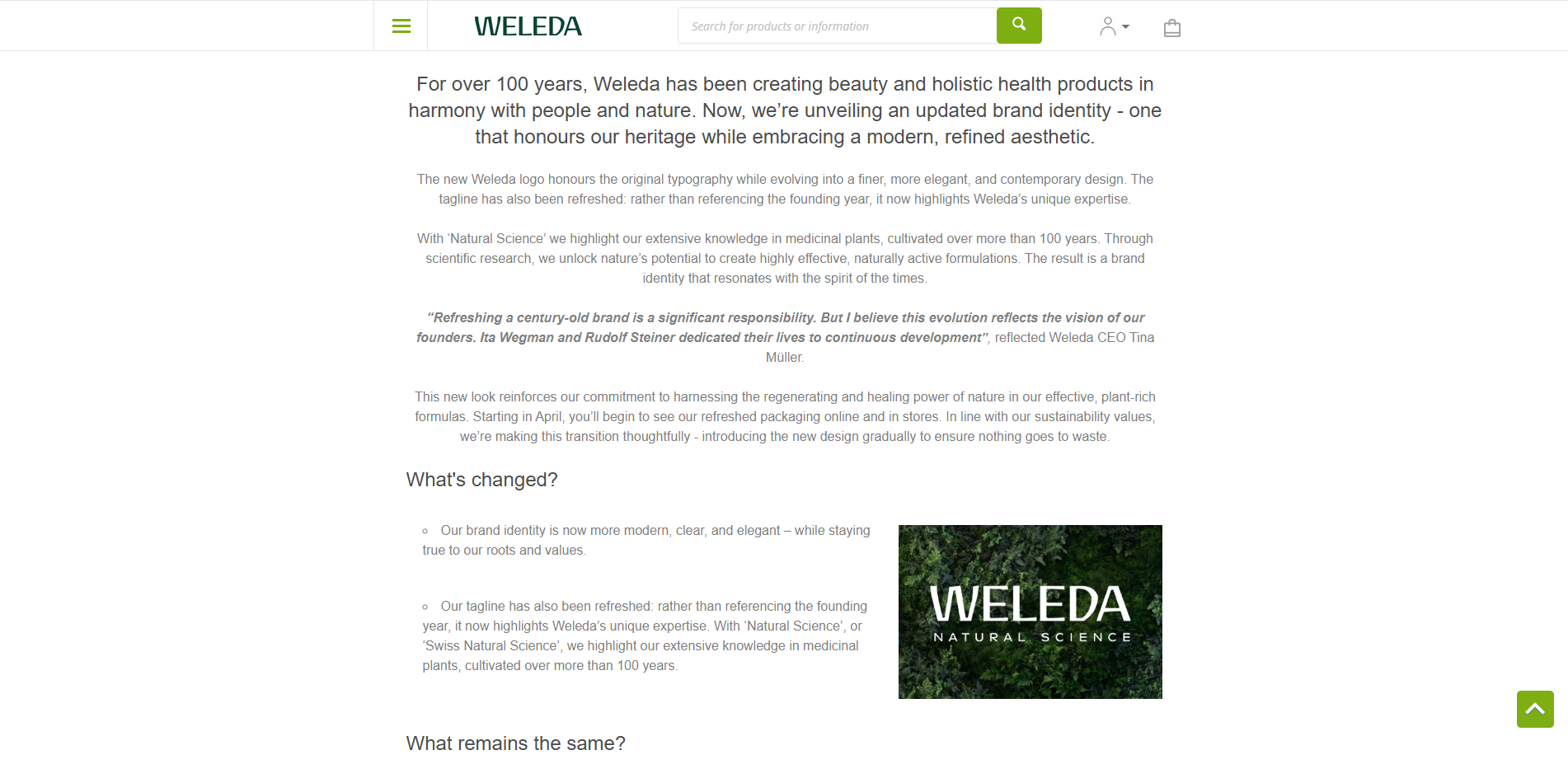
I don't think i even have to explain how bad this page is as a design. Just for refrence, Weleda is over a thousand times bigger than the company that made this website.
And then there's some other stuff that's pretty funny;
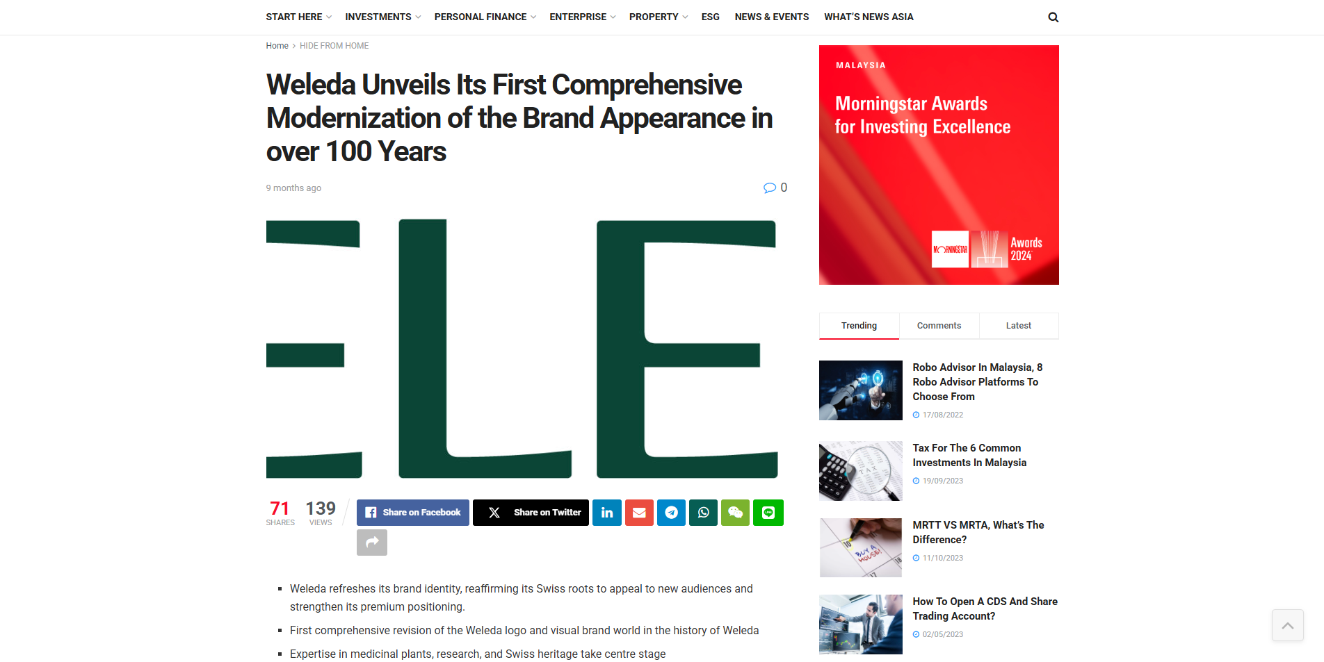
Weleda (or an agency acting on behalf of Weleda) used a press release distribution service to get the message about their rebrand out as far and as wide as they could get it. Of course, it was featured on beauty and other related sites, but it also ended up in places like the SmartInvestor Malaysia;
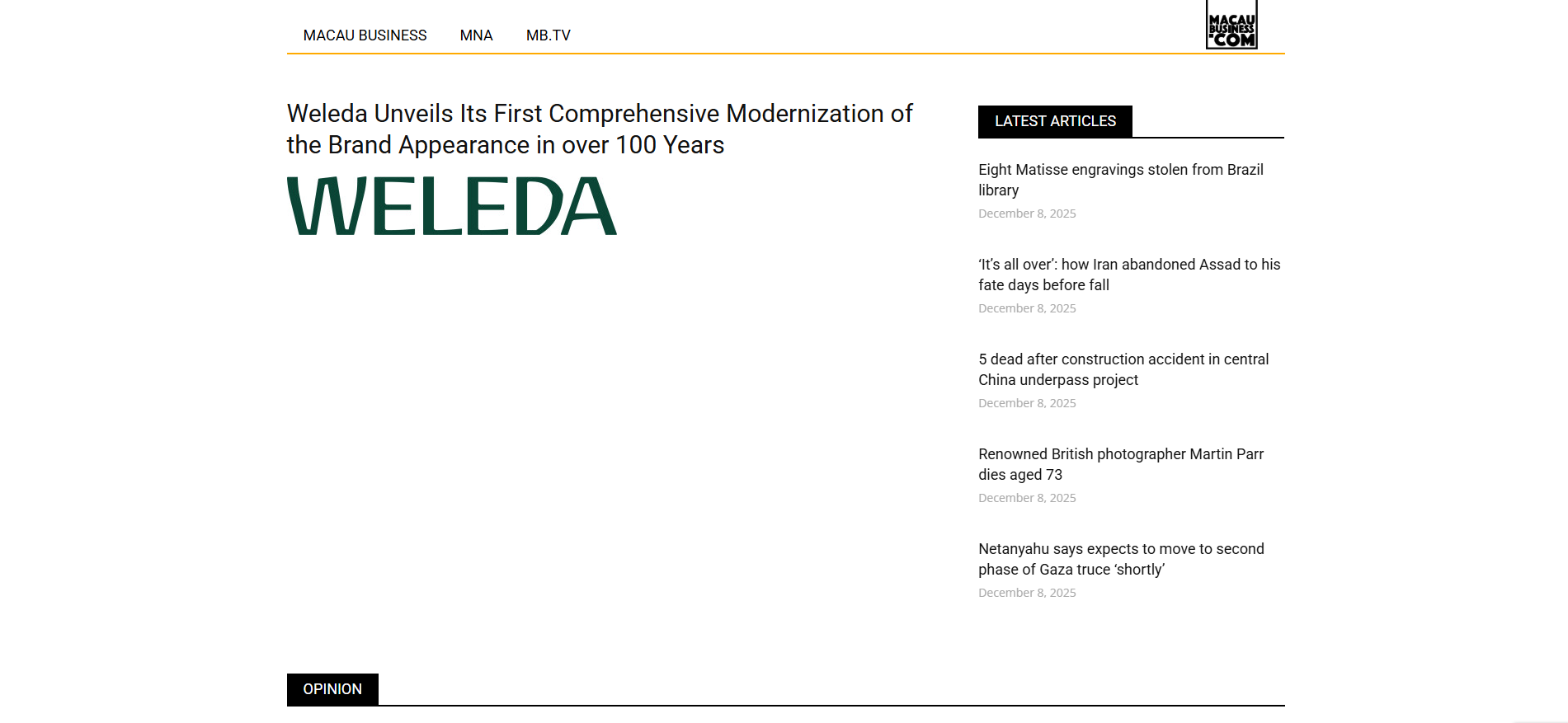
And Macau Buisiness, which, at the time of visiting, even after loading fully, didn't feel like even showing me the press release;
And the Laotian Times;
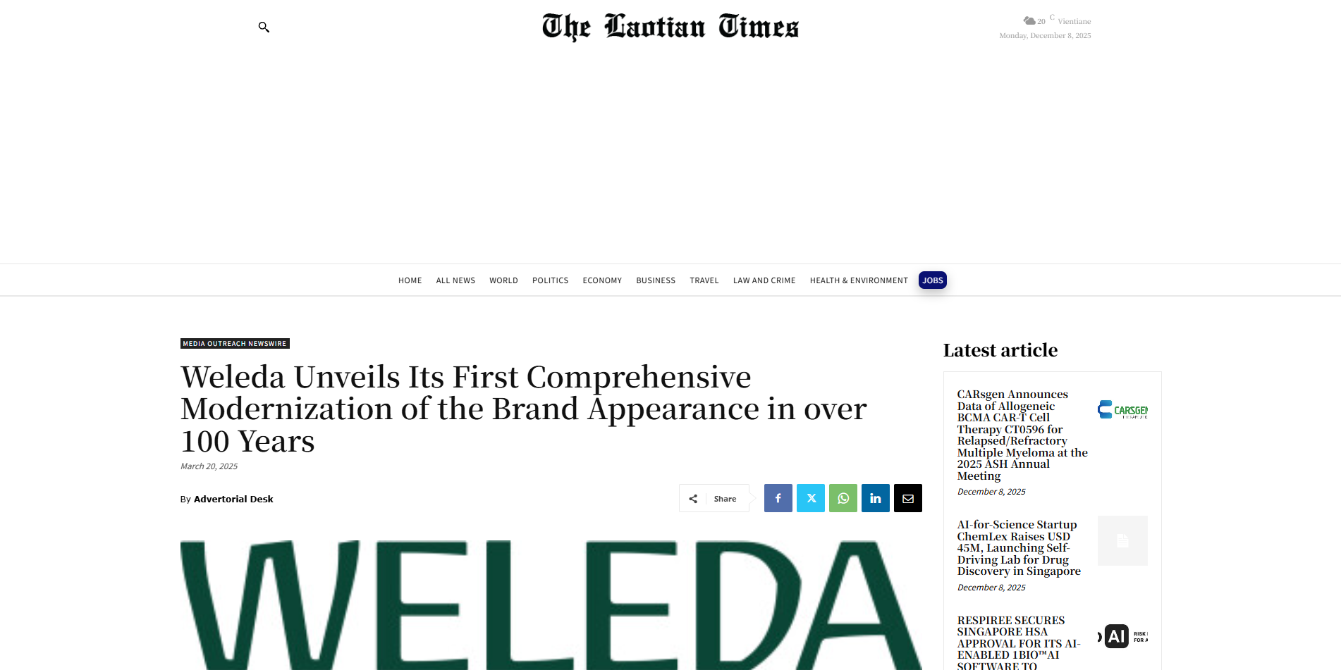
I hear you. They're using these websites because they have a presence in the area! Well, when you check their own international website, weleda.com, the list doesn't show a branch in China, or in Laos. So are these just extra (in my opinion) low quality websites that the press release distributor uses to increase the number of sites they deliver to? Maybe.
What they could have done
Not this. Something else. If Weleda has the goal of premiumising, then they should focus on that. This doesn't solve any of their problems. But of course, that, and everything else in this article, is just my opinion.
I'll finish this article with this final thought;
“Our brand identity is now more modern, clear, and elegant – while staying true to our roots and values” - CEO Tina Müller
Is it?
To Visit Weleda UK's website; click here: https://www.weleda.co.uk/


Discussion